Vertex Addons Search Input Documentation
このコンテンツはまだ日本語訳がありません。
The Search Input widget adds a search bar to your page, allowing users to search your site’s content. Unlike the default search bar, this widget offers an optional Live Search (AJAX) feature: as users type, it can display real-time search results beneath the input without reloading the page. This greatly improves the search experience by quickly guiding users to relevant content.
How to Use
Section titled “How to Use”- Drag into Page: In Elementor, find the Search Input widget under Vertex Addons - Site & Navigation and drag it into your page or template (for example, in a header or sidebar where you want a search box).
- Placeholder Text: In the Content tab, locate the Placeholder field. This text appears inside the search box before anything is typed (e.g., “Search…”). Enter a helpful prompt if desired or leave the default “Search…”.
- Search Button Text/Icon: Decide how the search submit button should look:
- Button Text: By default, it might say “Search.” You can change this text or clear it if you prefer to use just an icon.
- Icon: Choose an icon to display on the button (the default is a magnifying glass). You can remove the icon if you only want text on the button. The widget will display both the text and icon if both are set. For an icon-only button, simply remove the button text.
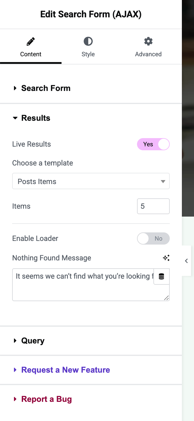
- (Optional) Enable Live Results: Toggle Live Results to Yes if you want search suggestions to appear as the user types (Ajax search).
- When enabled, select a template from Choose a Template. This template defines how each result is displayed in the live results dropdown. (For example, you might create a “Search Result Item” template via the Vertex Template Builder containing a post title, featured image, excerpt, etc.).
- If you haven’t created a result item template, you should do so first: create a Loop Item template in Elementor that includes dynamic fields for a search result (like post title, maybe featured image). Then come back and select it in this widget.
- Items: Set the number of results to show (e.g., 5 or 10). The default is 5. This limits how many suggestions display in the dropdown.
- Enable Loader: You can turn this on to show a loading spinner icon while the Ajax search is fetching results (useful feedback for the user).
- “No Results” Message: Customize the message shown when no matches are found (e.g., “No results found” or the default message). You can also choose what HTML tag wraps this message (span, div, or heading tags) for semantic purposes.
- Refine Search Query (optional): Under the Query section (still in Content tab), you can fine-tune what content is searched:
- Source (Post Type): By default, the search will look at all public content (posts, pages, etc.). You can restrict this to a specific post type (e.g., only Products, only Blog Posts) by selecting one from the dropdown. Choose All to search everything.
- Sort By: Choose the order of results (Title, Date, etc., or Default which typically is by relevance). This affects both live results and the order if the user presses Enter to go to the results page.
- Order: Ascending or Descending order for the sort (for example, if sorting by date, descending will show newest first).
- (These query settings will apply to the live results. If the user goes to the full search results page, WordPress will also consider the post type filter and order if those parameters are passed along.)
- Style the Search Form: Switch to the Style tab to adjust the appearance:
- Input Box: Set the background color of the search field, its padding (to control height), and border if needed. Adjust the Placeholder text color and typography so that prompt text is visible and styled.
- Text: Style the search input text (color, typography) so user entries are readable.
- Button: There will be styling options for the submit button - you can style its normal and hover state (text color, background color, border, etc.). Ensure the button stands out and is consistent with your theme (for instance, a search icon in a colored circle, or a simple text button).
- Live Results Dropdown: If Live Results is enabled, a results container will appear when typing. You may find style controls for this container in the widget (such as its background or item spacing) or it will inherit from the template you designed. Typically, the template controls the appearance of each item, but you might want to ensure the container has a proper background color or overlay.
- Test the Search: Save your changes and preview the page:
- Try typing a query in the search box. If Live Results is on and a template is selected, after typing a few characters (usually 3 or more), you should see a dropdown list of matching results appear below the field. Confirm that it shows items in the format you designed (title, etc.), and the number of items matches your setting.
- If you enabled the loader, verify a spinner or loading indicator appears while results are fetching.
- Test a query with no results to see your “Nothing found” message.
- Press Enter or click the search button to ensure it still takes you to the full search results page (for users who prefer that or if JavaScript is disabled). The search results page will use your theme’s search template.
- Test on mobile as well, making sure the search field and results are user-friendly (the live results box should be appropriately sized on smaller screens).
- Adjust as Needed: Based on testing, you might go back and tweak styles (for instance, make the results box taller if results are cut off, or refine the template design for results). The widget gives a lot of control, so you can fine-tune the experience.
With the Search Input widget in place, visitors can quickly find content on your site. The Live Results feature can significantly improve UX by providing instant feedback - users might find what they need after typing just a few letters. If you prefer a more traditional approach, you can leave Live Results off, and the widget will behave like a standard search form (redirecting to the search results page upon submit).