Vertex Addons Breadcrumb Documentation
本頁內容尚未翻譯。
The Breadcrumb widget generates a navigation trail (path) for the current page. It helps users understand where they are on your site and allows them to click back to previous sections (like category or parent pages). This enhances navigation and user experience, especially on sites with deep page hierarchies or eCommerce product categories.
The breadcrumb trail typically starts with “Home” and then lists parent pages or categories, ending with the current page title (which is usually not clickable).
How to Use
Section titled “How to Use”- Add to a Template/Page: In Elementor, drag the Breadcrumb widget into the location where you want the navigation trail to appear. It’s often used in page headers, above the title, or in dynamic templates for posts/products.
- Configure Links: By default, each segment of the breadcrumb (except the current page) is clickable, allowing navigation back to that page. If you prefer non-clickable/static breadcrumbs, toggle Disable Item Link to Yes in the Content settings. This will remove hyperlinks from all breadcrumb items, displaying them as plain text.
- Styling the Trail: Switch to the Style tab to customize the look of your breadcrumb:
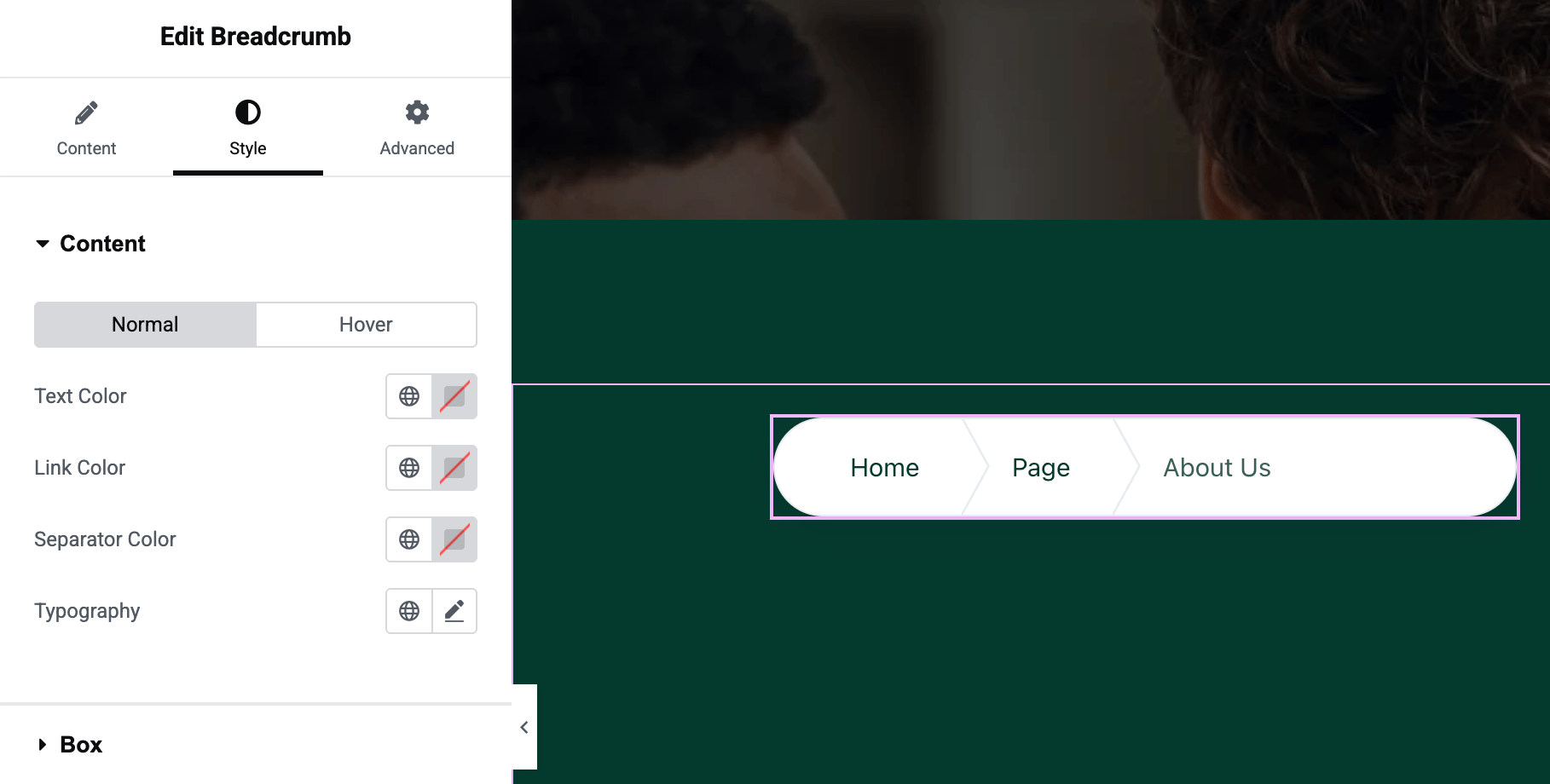
- Content (Items) Style: You can set the Text Color for the static parts and Link Color for the clickable parts of the breadcrumb. Adjust Typography to change font size, family, or weight for the breadcrumb text.
- Hover Style: Set the Hover colors if you want the links to change color when a user hovers over them (e.g., a different link color on hover).
- Separator Color: The breadcrumb items are typically separated by a symbol (for example, ”/” or ”>”). The widget uses a small separator element (often an arrow or slash). You can adjust the Separator Color to match your design (it might be controlled via the link color settings depending on the style).
- Box Styling: There’s a Box section in Style where you can adjust the background of the breadcrumb container (e.g., give it a subtle background color or keep it transparent), add padding, or borders. You can also set a border radius and box shadow if you want the breadcrumb to appear in a pill or boxed format.
- Responsive Considerations: Breadcrumbs usually display on larger screens. On smaller mobile screens, ensure the text isn’t too large. The widget’s typography settings can be made responsive (adjust font size separately for tablet/mobile in the Typography control) so that the trail wraps or scales appropriately on small devices.
- Save and Test: Update your page or template. View a page on the frontend that uses this breadcrumb (for example, if in a theme builder template, open a relevant page). Verify the breadcrumb shows the path (Home > Section > Page) correctly. Click the links (if not disabled) to ensure they navigate to the expected pages.
The Breadcrumb widget automatically figures out the hierarchy of the current page using WordPress’s structure (including blog categories, parent pages, product categories for WooCommerce, etc.). It requires no manual setup of links - just drag it in, and it will dynamically display the trail. This not only helps users navigate but can also provide a small SEO benefit by structuring links to your content.