The Dynamic Grid/Carousel widget is a powerful tool for displaying posts, pages, or custom post types anywhere on your site. Unlike the Archive Posts widget (which is tied to archive templates), Dynamic Grid/Carousel allows you to fetch any set of posts (recent posts, posts by a certain category, etc.) and present them in either a multi-column grid layout or an interactive carousel slider. It also includes advanced features like front-end filtering (letting users filter posts by taxonomy), “load more” pagination, and animated layout effects.
Custom Post Queries: Display posts from any source - latest blog posts, specific categories or tags, custom post types, or even manual selection. You have full control over which content to show.
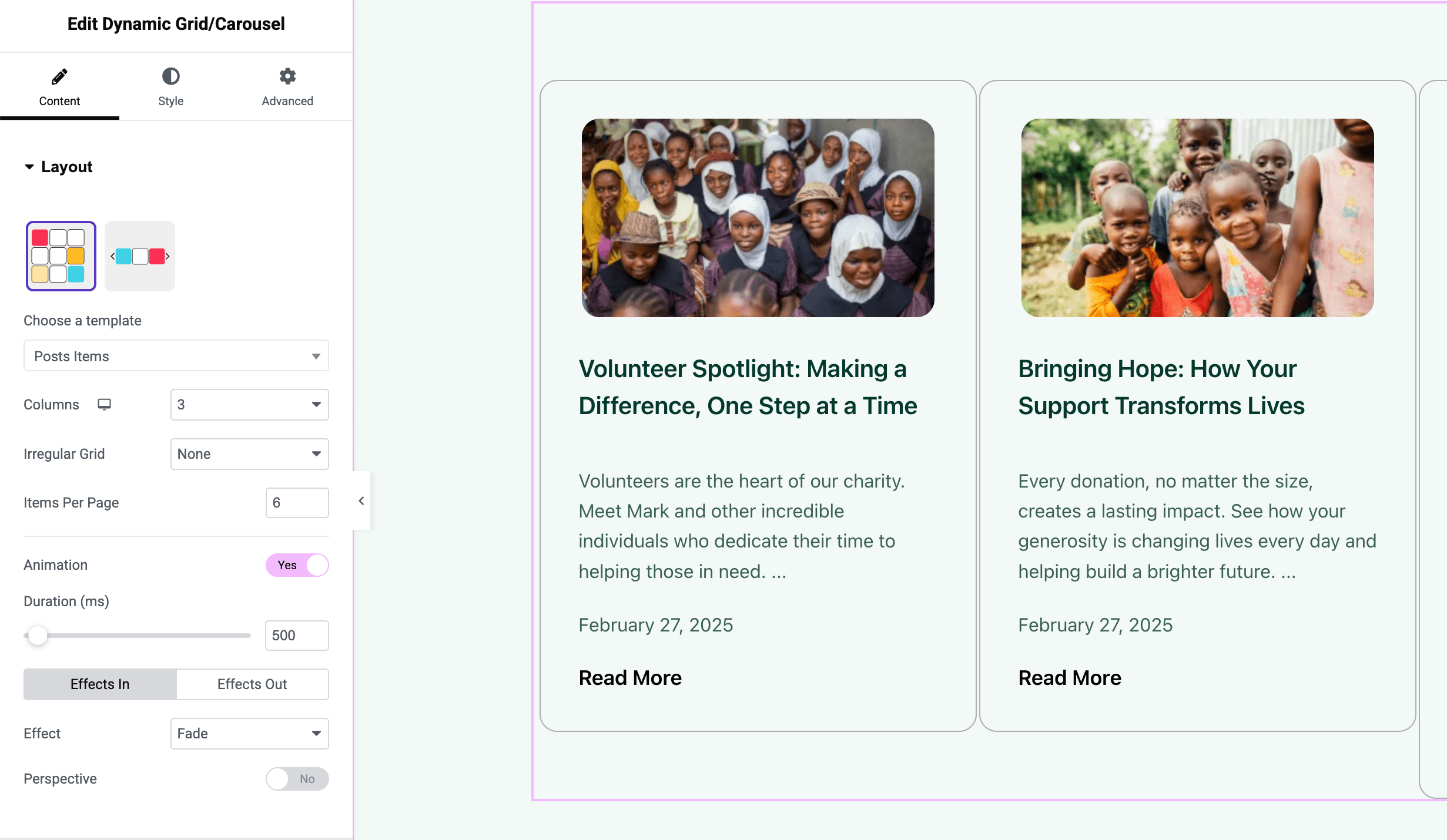
Grid or Carousel Layout: Toggle between a grid layout (with adjustable columns and masonry support) or a carousel slider. In Grid mode, you can create multi-column layouts or a masonry grid. In Carousel mode, you can slide through posts with navigation arrows or dots.
Front-End Filtering (Pro): Allow visitors to filter the displayed posts by taxonomy terms (e.g., buttons to filter by categories or tags) without page reloads. When enabled, this adds an interactive filter bar above the posts.
Load More & Pagination: For large post lists, enable Load More buttons or infinite scroll to dynamically load additional posts. Traditional pagination with page numbers or Prev/Next links is also available.
Rich Animation and Effects: Apply hover animations and transition effects. For example, you can enable animated entrance effects for grid items and smoothing filtering transitions (fading, scaling, etc.) for a dynamic, engaging experience.
Custom Item Templates: Go beyond the default card design - the widget supports using an Elementor Template for each post item (loop item template). This means you can design a single post card as a separate template and have the Grid/Carousel use that design for every post in the list.
Extensive Styling Options: Style every aspect of the post cards - image size and aspect ratio, title and excerpt typography, meta text appearance, background and border for the item, carousel navigation buttons style, filter bar style, and more.
Ensure that Dynamic Grid/Carousel is enabled in the Vertex Addons settings. You can check this via Elementor -> Vertex Addons in your WordPress dashboard. If it’s not active, toggle it on and save.
Add the Widget to a Page: In Elementor, drag the Dynamic Grid/Carousel widget onto your page or template. You’ll see it populate with some default posts (often the latest posts) in a grid format initially.
Select Content Source (Content Tab - Query Section): Under a Query or Content panel:
Source: Choose what content to display. Options include:
Post Type: e.g., Posts, Pages, or any custom post type on your site. If you select a post type, you can further filter by taxonomy.
Manual Selection: Pick specific posts/pages manually (a selection field may appear to choose exact items).
Current Archive: (If using inside an archive template) to inherit the current archive’s posts - but generally you’d use Archive Posts widget for that scenario.
Related Posts:(If available) to show posts related to the current one (commonly filtered by taxonomy).
Filters: Depending on source, you can narrow by taxonomy terms. For example, if source is Posts, you might select a Category (or multiple) to pull posts from, or leave blank to get all.
Posts Per Page: Set how many items to display initially.
Order By: Choose sorting (date, title, random, etc.) and ascending/descending order.
Layout Settings (Content Tab - Layout Section): Decide between Grid or Carousel:
Layout Mode: Select Grid (default) or Carousel. For Grid:
Columns: Set number of columns for desktop, tablet, mobile.
Masonry: Enable Masonry if you want the grid to auto-fit posts of varying heights (no uniform rows).
Gap: Adjust the row and column gap between items.
Item Template: If you have a custom loop template, select it here (choose an Elementor template to define each item’s design).
For Carousel mode:
Slides to Show: How many items visible per slide (e.g., 3).
Slides to Scroll: How many items advance per swipe/click.
Navigation: Toggle arrows and/or dots on/off.
Autoplay: Enable auto-scroll and set speed and pause on hover as needed.
Loop: Decide if the carousel should loop back to the start.
Front-End Filter Options (Content Tab - Filter Section):(Pro feature) If you want users to filter the posts:
Enable Filter: Choose one or multiple taxonomy terms to generate filter buttons (e.g., select Categories - the widget will create buttons for each category of the posts shown).
“Show All” Label: Customize the text for the “All” filter button (default “Show All”).
Filter Logic: If AJAX filtering is on, clicking a filter will fetch posts via AJAX; if off, it filters items already on the page (useful with smaller sets or when all posts are loaded).
Count Badges: Optionally display a count of posts next to each filter name.
Filter Alignment & Style: (See Style tab for design options of filter bar and buttons.)
Post Content Settings (Content Tab - Item Content): Configure what each post item shows (if not using a custom template):
Image: Toggle the featured image on/off. Set the Image Size (thumbnail, medium, large, full, or custom) for an optimal balance between quality and performance.
Title: Show or hide the post title. If shown, you can enable linking the title to the post’s single page (recommended for user navigation).
Excerpt: Show or hide the excerpt. If shown, set a word limit for consistency. You can also choose to override manual excerpts with the set length.
Meta Data: Select which meta info to display beneath the title (Author, Date, Time, Comments count, etc.). The widget might offer checkboxes or a multi-select for meta elements. You can input a separator character (like a bullet • or pipe |) to be placed between meta items.
Read More: Optionally display a “Read More” link or button. Customize its text (e.g., “Read More”, “View Details”) and decide if it appears as a text link or button.
Style Your Posts (Style Tab): There are multiple subsections here:
Card/Item: Set background color or hover background for the item container. Add a border or shadow if desired. Adjust padding inside each item to space out content.
Image: If images are shown, you can adjust the corner radius (make images rounded), add CSS Filters (grayscale, brightness, etc.) for a consistent style, and define a hover animation (like zoom-in on hover).
Title: Control the title’s typography (font family, size, weight), text color, and spacing (e.g., margin-bottom).
Excerpt: Style the excerpt text - choose an easy-to-read font size/color, and line-height for readability.
Meta: Style the meta information (author/date/etc.). Often this is made smaller or a muted color. You can adjust the typography and color, and even add spacing or an icon separator.
Read More Button: If enabled, style it like a button - set typography, text color, background color, border radius, padding, and hover styles. Ensure it stands out appropriately or fits your design.
Filter Bar: If filtering is active, you’ll have Filter style options:
Filter Bar Background: Set a background color or border for the filter button container.
Filter Buttons: Style normal vs active state - text color, background, border for the filter buttons. For example, the active filter might have a highlighted background. You can also adjust spacing between filter buttons and padding within them.
Filter Alignment: Align the filter buttons group to the left, center, or right.
Pagination/Load More: Style the pagination controls. Numbered pagination can be styled for normal, hover, and active page states (colors, background, border radius). The Load More button can be styled similarly to any button (match it with your theme’s buttons).
Carousel Nav: If in carousel mode, style the navigation arrows or dots:
Arrows: Customize arrow icon color, background (for the circle/container), size of the icon, and position (you can position arrows inside or outside the carousel, for example).
Dots: If using dots, set their size/color for normal and active states and spacing (dot navigation typically appears below the carousel).
Advanced Settings (Advanced Tab): Use Elementor’s advanced settings as needed (motion effects, responsive settings to show/hide on certain devices, etc.). Notably, if you have many posts, you might want to enable lazy loading for images (if not automatic) or other performance tweaks.
Use a 3-column grid of custom post type “Portfolio” items, enable a category filter (e.g., by project type), and allow users to filter without page reload. Masonry layout and hover animations can add a creative touch.
Latest Blog Posts Carousel
On your homepage, display the 5 latest blog posts in a stylish carousel. Enable autoplay so it slides automatically, and style it to match your site’s theme.
Product Listings
If you have a custom post type for products (and no WooCommerce), you could use this widget to create a shop page with filtering by product category, using custom templates for each item to include price and other details.
The Dynamic Grid/Carousel widget is one of the most versatile widgets in Vertex Addons, giving you the ability to craft advanced post listings and sliders. By combining query controls, layout flexibility, and interactive filtering, it can serve needs ranging from blogs and news sites to portfolios and galleries. Spend some time fine-tuning the design and testing the behavior (especially if you enable filters or load-more functionality) to ensure a smooth user experience.