Vertex Addons Offcanvas Menu (Sidebar) Documentation
The Offcanvas Menu widget lets you add a hidden sidebar that slides into view when triggered by a button. This is great for mobile navigation (hamburger menu that slides out), or any time you want to tuck away a menu or content until the user needs it. The widget provides the trigger button and the mechanism; you populate the off-canvas panel with content by selecting an Elementor template.
How to Use
Section titled “How to Use”- Prepare Offcanvas Content (Template): First, decide what will appear in the sliding offcanvas panel. Typically this could be a navigation menu (using the Advanced Menus widget) or any other content (links, contact info, etc.). Create this content as a saved Elementor template:
- Go to Templates (or Vertex Templates) in WordPress and Add New. Choose a Section (or similar) and design the content you want in the sidebar. For example, you might drag an Advanced Menu widget here for a menu, or create a vertical list of links.
- Save the template (e.g., name it “Offcanvas Menu Sidebar”).
- In Elementor Editor - Add Offcanvas Widget: Edit the page or template where you want the offcanvas trigger (commonly the site header or a mobile menu area). Drag the Offcanvas Menu widget (under Vertex Addons - Site & Navigation) onto the canvas.
- Select Template for Offcanvas: In the widget’s Content tab (labeled Offcanvas), use Choose a Template to select the template you created in Step 1. This tells the widget what content to load into the offcanvas panel.
- After selecting, you won’t immediately see the content on the page (since it’s hidden offcanvas), but the widget is now linked to your template.
- Configure the Trigger Button: Switch to the Button section under Content to set up the appearance and text of the trigger:
- Button Text: By default it might say “Menu”. You can change this text or remove it if you want icon-only.
- Button Icon: A default hamburger icon (≡) is provided. You can choose a different icon (or none). Common choices are three-bars for menu, or any custom icon.
- Icon Position: Set whether the icon appears Before or After the text, or use just the icon by clearing the text field.
- Display Style: Choose to show the button as Block (taking full width of its container) or Inline (fits to its text/icon width). For example, Inline is often used when the icon sits alongside other items.
- Alignment: Use the alignment option to position the button left, center, or right within its column (this is a responsive control, so you can, for instance, center it on mobile only).
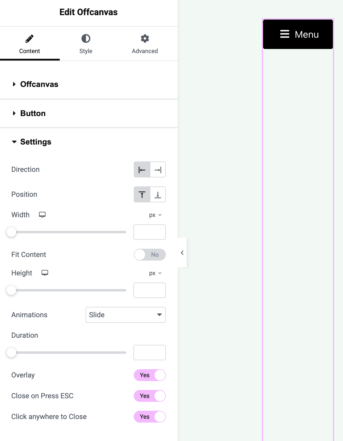
- Offcanvas Settings: Under the Settings section in Content, configure how the offcanvas panel behaves:
- Direction: Choose whether the panel slides in from the Left or Right side of the screen (e.g., a typical mobile menu might slide from left).
- Width: Set the width of the offcanvas panel. This can be in pixels or viewport width (vw). For example, you might set 300px or 80vw. This determines how wide the sidebar is when open.
- Height: By default, the offcanvas panel height is set to fill the screen (100%). If you prefer a shorter panel, you can specify a height (in px or vh). If a fixed height is set, content can scroll internally.
- Animation: Choose Slide (the panel slides in with a transition) or None (it will simply appear). Slide is usually preferred for a smooth effect. You can adjust the Animation Duration (speed in milliseconds) if needed.
- Overlay: Toggle Overlay to Yes to display a semi-transparent overlay behind the panel when it’s open (this darkens the rest of the page, focusing attention on the menu). This is on by default for better UX.
- Close on ESC/Outside Click: Leave Close on Press ESC enabled so users can press the Escape key to close the menu. Similarly, Click Anywhere to Close will allow them to click outside the panel to close it. These defaults make the offcanvas behave like a typical modal menu.
- Pro Fit Content: If you have Vertex Pro, you can enable Fit Content to automatically adjust the offcanvas panel’s height to fit its content instead of taking a fixed height. In free version, the panel height is typically full-screen (or the custom height you set).
- Pro Position: Vertex Pro adds the ability to slide in from Top or Bottom as well. In the free version, offcanvas comes from left or right only.
- Style the Offcanvas Button: Go to the Style tab:
- Button: Customize the trigger button’s typography, text color, background color, padding, border, etc. You can style the Normal and Hover states (and Active if needed) separately. For example, you might have a transparent background with just an icon, or a colored button.
- Button Icon: If you use an icon, adjust its size and color (Normal/Hover). You can add spacing/margin around it. Ensure the icon is visible (contrast) against the button background.
- (The offcanvas panel itself inherits styles from the template content you selected. For example, if your template has a section with a colored background, that will show. There aren’t separate style controls for the panel’s design in this widget; you design that in the template.)
- Save & Test: Update the page/template. On the live site, click the trigger button:
- Verify that the offcanvas panel slides in from the chosen side and displays the correct template content.
- Test the close functionality: click the close icon (if your template includes one or if the user is expected to click the overlay), press ESC, or click outside - the panel should close.
- Check on different devices or screen sizes. The offcanvas approach is especially useful on mobile, so ensure it looks good on a phone screen. The overlay and scroll (the main page should not scroll while panel is open) should work properly.
The Offcanvas Menu widget essentially bridges your content (via a saved template) with a toggle mechanism. It’s very flexible: you could use it for a slide-in newsletter sign-up, a cart sidebar, or any content - not just menus. However, its primary use is for navigation menus on small screens or secondary menus. By designing the panel in Elementor, you have full control of that content’s layout and style.