Este conteúdo não está disponível em sua língua ainda.
The Advanced Menus widget allows you to display a WordPress menu on your site with additional layout options and styling beyond the default. You can create standard horizontal menus, vertical menus, or even a responsive “hamburger” toggle menu - all using the menu items you set up in Appearance > Menus.
This widget is perfect for building site headers, sidebars, or footer navigation with full control over design and responsive behavior.
In WordPress Admin - Prepare Your Menu: Make sure you have a menu created under Appearance > Menus with all the pages or links you want to display. You can create multiple menus (e.g., a main menu, a secondary menu) and choose the one to use in this widget.
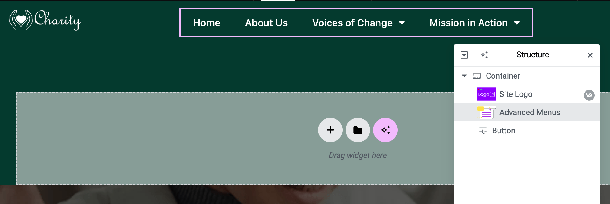
In Elementor Editor - Add the Widget: Drag the Advanced Menus widget into your page or template (commonly in a header or sidebar section). It’s under Vertex Addons - Site & Navigation in the widget panel.
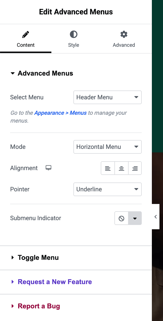
Select Menu: In the Content tab, choose which Menu to display from the dropdown (it will list your WordPress menus by name). Once selected, the menu items will instantly populate in the preview.
Choose Layout (Mode): Set the Mode (layout) of your menu:
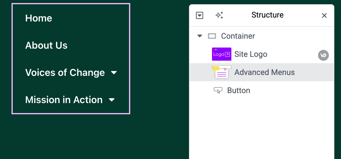
Horizontal Menu: Menu items will appear in a row (great for header nav bars).
Vertical Menu: Menu items will stack in a column (useful for side menus or footers).
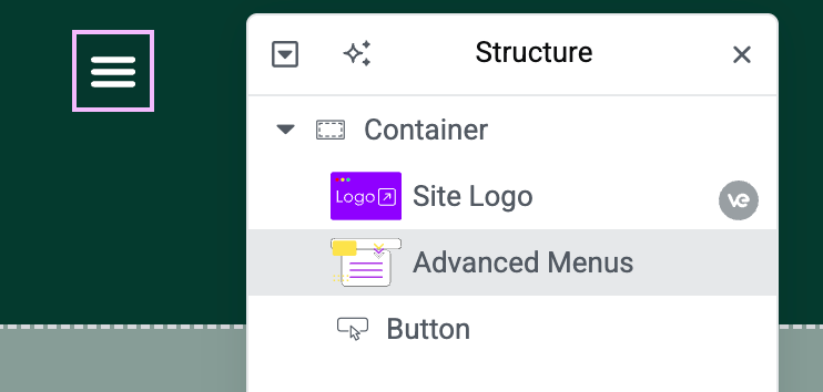
Toggle Menu: Displays as a hamburger toggle button that reveals the menu (ideal for mobile or when you want a collapsible menu).
ProMega (if available): If Vertex Pro adds mega menu capabilities, those can be configured separately.
Responsive Toggle (Breakpoint): If you want your horizontal/vertical menu to collapse into a hamburger icon on smaller screens, adjust the Breakpoint under Toggle Menu settings. For example, choose Mobile (767px) or Tablet (1024px). Below that width, the menu will automatically switch to a toggle button. (Select “None” if you want to disable the automatic responsive toggle.)
Width Options: Decide how the menu is sized:
Default: The menu container width will auto-fit its content.
Fit to Section: The menu will stretch to the width of its section/container.
Full Width: The menu (or its dropdown) will span 100% width of the page/container.
These options particularly affect dropdown/toggle menus, determining how the menu expands.
Toggle Button Style: If using a toggle menu (either always, or on responsive breakpoint), you can customize the hamburger button:
Toggle Button Icon: By default, a ”☰” (hamburger) icon is used. You can change the Normal Icon (e.g., to a custom icon or “MENU” text using an icon font) and the Active Icon (the icon when menu is open, default might be an ”✕” close icon). Set these in the Toggle Button section.
Icon Appearance: Choose to show just an icon, text, or both. For example, you might have text “Menu” with an icon. (If only an icon is desired, you can leave the text field blank.)
Alignment: Align the toggle button left, center, or right within its container for proper placement.
Pointer & Submenu Indicator: If using horizontal or vertical layouts, you can set a Pointer style for menu items (e.g., underline on hover, overline, double line, or none). Also customize the Submenu Indicator icon (the small arrow or symbol that shows a menu item has a dropdown submenu). This helps users identify parent menu items.
Style the Menu: Switch to the Style tab for extensive design options:
Menu Items: Customize typography (font, size), text color, background color for normal, hover, and active states. You can also adjust spacing between items (padding/margin).
Submenu Dropdowns: Style the dropdown menus (background color, border, animation if any, and link colors for submenu items).
Toggle Button: Style the hamburger button and icon (color, size, background, border, etc.) for both normal and active states.
Alignment & Padding: If using vertical menus, you might adjust item alignment (left/center) or indent submenus. For horizontal, you might justify content to left/center/right via the alignment setting.
Save & Test: Publish or update your page/template. Test the menu on the live site:
On desktop, ensure the menu looks correct (horizontal or vertical as set, with dropdowns working on hover or click as expected).
Resize the browser (or use a mobile device) to test the responsive toggle: the menu should convert to a hamburger icon at the chosen breakpoint, and clicking it should reveal the menu items. Verify submenu toggle functionality on mobile (often submenus will expand accordion-style on click in mobile view).
Check that styling (colors, hover effects, active item highlighting) matches your design expectations.
Using Advanced Menus, you can craft a navigation that fits perfectly with your site’s design. Unlike the default Elementor Nav Menu widget, Advanced Menus provides more control and styling flexibility. You can, for example, create a fully custom-styled menu bar with interactive pointers and custom icons. It pulls directly from your WordPress menus, so updating menu items in WP will update the Advanced Menu on your site automatically.
Horizontal Menu: A traditional top navigation bar with items in a row. Perfect for header menus on desktop.
Vertical Menu: A stacked list of links, ideal for sidebars or footer navigation sections.
Toggle (Hamburger) Menu: A collapsed menu that expands on click, commonly used for mobile navigation.