The Comments Form widget is a comprehensive element that handles both the display of existing comments on a post and the comment submission form for new comments. It’s designed for use in single post templates (or any page where you want a comments section), enabling user interaction and feedback on your content. By placing this widget, you can show all comments on the post, and provide a form for visitors to leave their own comments, without any additional coding.
Edit your Single Post template with Elementor (or the individual post page if not using a template).
Locate the Comments Form widget in the widget panel (under Theme Elements or Post elements).
Drag Comments Form into the desired place on your post template - typically at the bottom of the post, after the content (and perhaps after an Author Box if you use one).
Once added, the widget will automatically fetch and display comments for the current post when viewed on the live site, and show a “Leave a Reply” form if comments are open.
Adjust settings in the Content tab if needed (e.g., toggle features like avatars, field labels, placeholders, etc. as described below).
Style the comments list and form under the Style tab to fit your design. You can style things like comment text, author name, dates, form inputs, submit button, etc.
The Comments Form widget handles a lot out-of-the-box:
It automatically checks if comments are allowed on the current post. If comments are closed (disabled), the widget will simply not render anything on the frontend (in Elementor edit mode it might not show anything if no output).
If comments are open, it will:
Display the current number of comments and list them in a threaded format (including nested reply threads).
Show each comment’s author name, avatar (if enabled), date/time, and content.
Include a “Reply” link for each comment so users can respond to specific comments (nested replies).
Display a submission form at the bottom (or inline under a comment when replying, depending on settings) with fields for name, email, website (optional), and the comment text, along with a submit button.
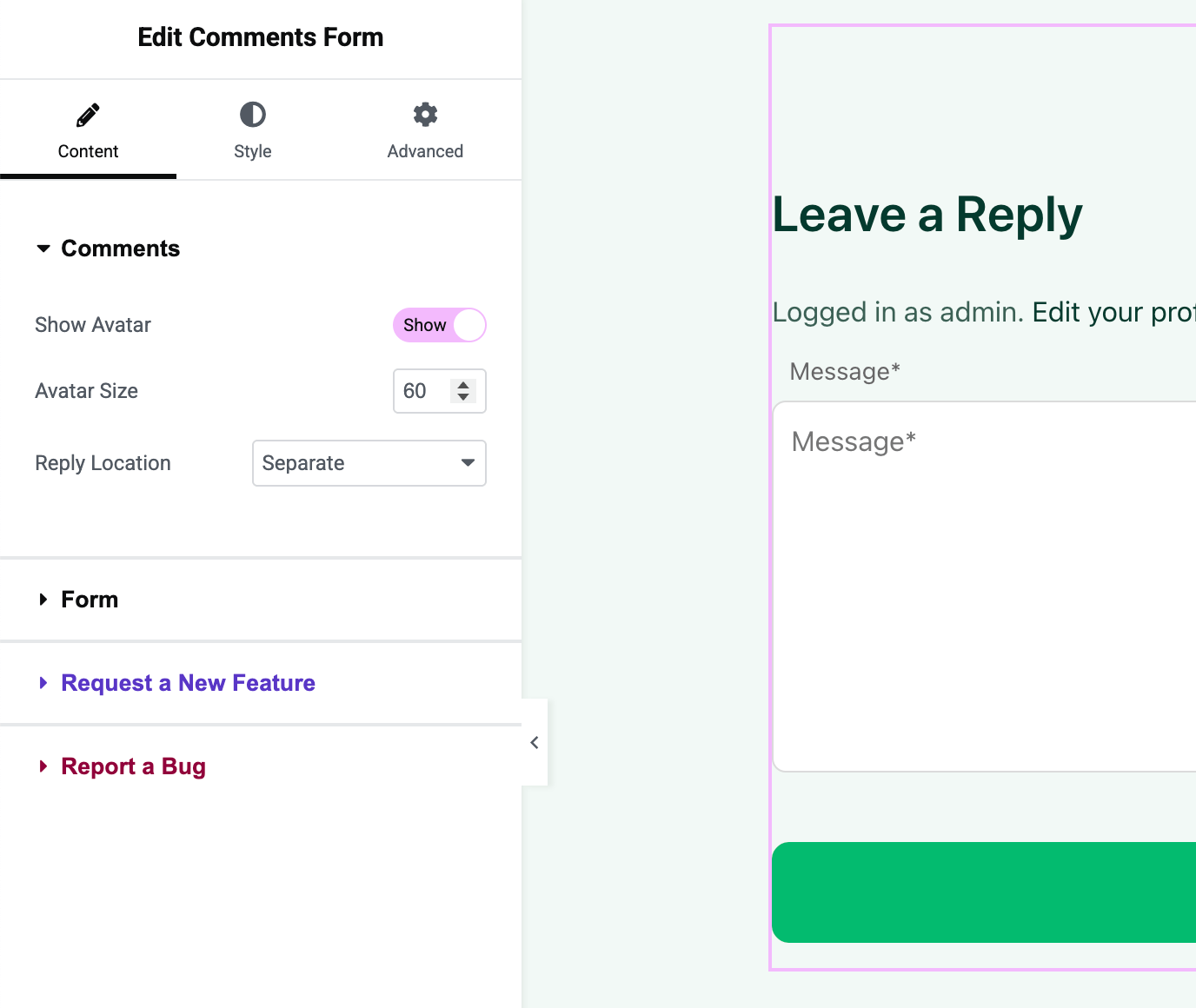
In the Content tab of the Comments Form widget, you’ll find two sections: Comments and Form.
Comments Settings:
Show Avatar: Toggle whether to display commenter avatars next to each comment. Default is “Yes, ” which will show the avatar (profile image) of each commenter (if available, typically via Gravatar). If you turn this off, the comments list will just show names without images.
Avatar Size: If avatars are enabled, you can specify the size (in pixels) for the avatar images. Default is 60px, but you might adjust it smaller or larger depending on your design. This size applies to all comment avatars.
Reply Location: Choose how the reply form appears when a user clicks a comment’s “Reply” link:
Inline: (Default setting) The reply form will appear directly underneath the comment you are replying to, making it clear which comment is being responded to.
Separate: The reply form remains in its original position (usually at the bottom of all comments) even when replying. In this mode, clicking “Reply” may simply move focus to the main form without repositioning it under the comment.
Inline is the typical behavior in most themes, as it provides better context by nesting the form. Separate might be useful if you prefer the form to always stay at the bottom.
Form Settings:
Title: You can customize the heading text that appears above the comment form. By default, this is “Leave a Reply”. You can change it to something like “Join the Discussion” or any phrase. This title is dynamic (it supports translation and can also be set to empty if you don’t want a title).
Show Labels: Toggle whether to show field labels (Name, Email, Website, Comment) above the form fields. Default is “Yes” (labels visible). If you prefer a cleaner look, you can turn labels off, the form will then rely on placeholders or context to identify fields.
Show Placeholders: Toggle placeholders inside the form fields. Default “Yes” shows placeholder text within each input (e.g., “Name*”, “Email*”, “Website”, “Message*”). This is helpful if you choose to hide labels, so the user still knows what to input. If both labels and placeholders are off, the fields will be blank with no prompt text (not recommended).
Show Website Field: Toggle the inclusion of the “Website” field. By default this is “Yes”, meaning the form will include an optional field for the commenter’s website URL. If you turn this off, the Website field will be removed entirely (useful if you want to simplify the form and reduce spam links).
Submit Button Text: Customize the text on the submit button. The default is “Submit”. You might change it to “Post Comment” or “Send”. This text can also be translated via dynamic tags if needed.
The Style tab provides extensive controls to design the look of both the comment list and the form. Key style groupings include:
Comments List Style:
Comment Item: You can set different background colors or styling for alternating comments (odd/even). For instance, give a subtle shaded background to every other comment to distinguish them. The widget provides separate style settings labeled Odd and Even for comment items.
Avatar: If avatars are on, you can adjust their border radius (to make them circular, which is common, set 50%), add a border, or change their size responsively here. You can also space the avatar from the comment text.
Author Name: Style the commenter’s name (color, typography). You might bold the names or use a specific color for them. If you want, you can even add an icon or pseudo-element via custom CSS, but within the widget you control basic text style.
Metadata (Date): Customize the appearance of the comment date/time (and “Edit” link if you’re an admin). Typically, this might be smaller or lighter in color. There may be a specific setting for metadata or it might be grouped under comment text.
Comment Text: Adjust the typography and color of the comment content itself. You can set the font size, line height for readability, and text color. There’s also an option for Link Color (for any links within comments) and possibly Link Hover Color.
Reply link: Style the “Reply” link that appears for each comment. You can treat it like a small button or link - set its text color, maybe give it an icon (if using custom CSS), or just style the hover state.
Spacing: Control the gap between individual comments, and indent for nested replies. The widget likely automatically indents replies, but you can adjust margins/padding if needed.
Form Style:
Form Title: Style the “Leave a Reply” title - font size, color, margin. For example, you might want this title to be bold and slightly larger than the comment text.
Input & Textarea Fields: Customize the appearance of the Name/Email/Website input fields and the Comment textarea. You can set:
Border color, width, radius (e.g., give inputs rounded corners).
Background color of fields (e.g., keep them white or match your theme’s form style).
Text color and typography for the input text.
Padding inside the fields (height of the field can be adjusted via padding and line-height).
Placeholder color (often a slightly lighter shade).
Margin between form fields (vertical spacing).
Labels: If you chose to show labels, you can adjust their typography (maybe italic or smaller) and color.
Submit Button: Style the submit button at the bottom:
Button text typography and color.
Button background color - both normal and hover states.
Border radius for the button (e.g., pill-shaped or square edges).
Padding for the button (to control its size).
Hover effects: color change, background change, maybe a box-shadow on hover.
Form Layout: Adjust the spacing above the form (margin top) or overall padding of the form container. If the form is separate, you might want extra spacing between the last comment and the form.
Let’s say you have a blog post with two comments already. Here’s how the Comments Form widget would appear:
Comments List
2 Comments are displayed. The first comment shows the avatar of the commenter (e.g., a gravatar image), the name Alice in bold, and the date she commented (e.g., July 20, 2025 at 3:15 pm). Her comment text follows below. Under her comment, there’s a Reply link that users can click to respond to Alice.
Nested Reply
The second comment is a reply to Alice by Bob. It is indented slightly to the right (indicating it’s a child reply). Bob’s avatar and name are shown, with his comment text. If Inline reply is enabled, clicking “Reply” on Alice’s comment will slide open the form right under Alice’s comment, indented at the same level as Bob’s was.
Comment Form
Below the comment list is the Leave a Reply section. It includes fields for Name, Email, Website (if enabled), and a larger Comment textbox. Each field is labeled (unless you hid labels) and/or contains placeholders. The Submit button is at the bottom. If the user is logged in, Name/Email fields are replaced with a note like “Logged in as [Username]”. Upon clicking Submit, the comment will be added and displayed instantly if approved (or a message will show if it’s held for moderation).
Place the Comments Form widget in templates for posts, custom post types, or anywhere you expect user feedback. It won’t do anything on pages where comments are disabled, so it’s safe to include in a template.
Keep the form fields to a minimum required. Often, disabling the Website field can reduce spam (as spammers often fill that field with links). You can do this easily with Show Website Field = No.
Ensure the styling of the comments section matches your site. For example, comment text might be slightly smaller than body text, and the submit button should use your brand color.
Test the Comments Form as a logged-out user (you can open your site in an incognito window) to see the full flow, the widget will show the name/email fields and let you post a comment. This will give you a feel for the user experience.