Vertex Addons Sticky Documentation
यह कंटेंट अभी तक आपकी भाषा में उपलब्ध नहीं है।
The Sticky extension allows you to keep any section, column, or widget “stuck” to the viewport as the user scrolls down the page. In other words, a sticky element remains visible on screen (usually at the top) instead of scrolling off. This is great for things like sticky headers, menus, or important call-to-action boxes that you want to always be accessible. It helps draw attention and keeps key content in view.
How to Use Sticky
Section titled “How to Use Sticky”-
Enable the Extension: Check that Sticky is active under Vertex Addons > Extensions in your WordPress dashboard (activated by default).
-
Edit the Page with Elementor: Go to the page where the element you want to make sticky is located. Click Edit with Elementor.
-
Select the Element: Click on the section, column, or widget that you want to stick on scroll. For example, if you want a particular banner or menu to be sticky, select that section in the editor.
-
Enable Sticky in Advanced Settings: With the element selected, navigate to the Advanced tab in the Elementor sidebar. Scroll down and find the Sticky section (added by Vertex Addons).
- Toggle Enable Sticky to Yes.
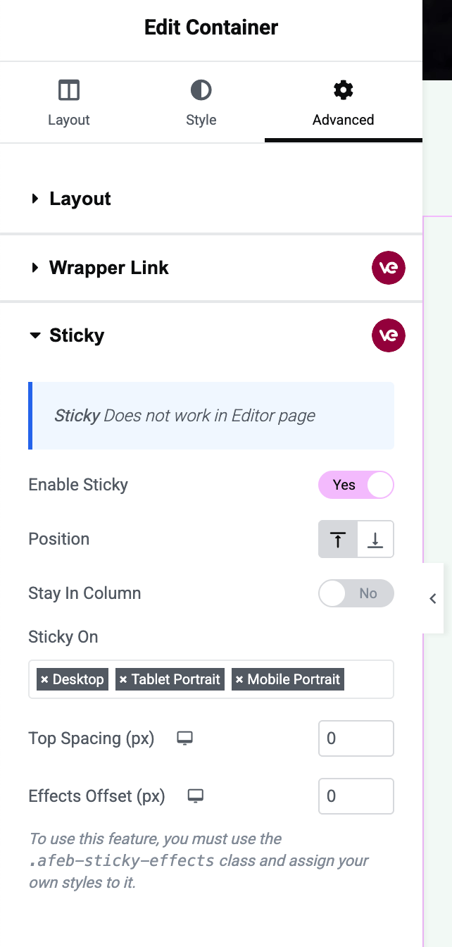 The Sticky options in the Advanced tab are shown in this image. “Enable Sticky” is turned on for a section, and additional options like “Stay In Column” and “Top Spacing” are visible.
Once enabled, a few additional options will appear:
- Stay In Column: If the element you made sticky is inside a column or container, enabling “Stay In Column” ensures it will not overflow outside that column’s area. In practical terms, the element will scroll normally once it reaches the bottom of its container, instead of overlapping content below. Turn this on if you want the sticky element to only stick within its section/column boundaries.
- Top Spacing: This option lets you add spacing (in pixels) from the top of the viewport when the element becomes sticky. For example, if you have a fixed header or just want some gap, you might set Top Spacing to 50px or so. By default, it might be 0 (meaning the sticky element will stick to the very top of the screen).
-
(Optional) Adjust Settings: The Sticky extension in the free version will stick the element to the top of the page on all devices (desktop, tablet, mobile) by default. If you find that on a small screen the effect isn’t desirable, you can consider hiding that element on mobile via Visibility Controls (or leave it, depending on your design). The free version doesn’t include device-specific toggles for sticky, so any enabled sticky element applies to all viewports.
-
Update the Page: Click Update to save your changes.
-
Test the Sticky Behavior: View the page on the live site and scroll down:
- The element should initially scroll normally with the page. As it reaches the top of the viewport, it will “stick” there and remain visible even as other content continues to scroll underneath it.
- If you enabled “Stay In Column, ” scroll further to ensure that when the parent section ends, the element unsticks (useful for footers or when there’s a footer section after the sticky element’s section).
- Check the spacing, if you set Top Spacing, confirm there’s the intended gap above the sticky element when it’s fixed.
A common use for Sticky is to keep navigation or headlines visible. For example, you might stick a sidebar contact box so it’s always on screen as the user reads an article, or make a top promo bar stay visible. With this extension, you achieve that effect with just a toggle and without any custom code.