Vertex Addons Ripple Effects Documentation
Ce contenu n’est pas encore disponible dans votre langue.
The Ripple Effects extension introduces a Material Design-inspired ripple animation whenever users click on an element. This means a quick, radiating circle effect will appear at the point of click, giving users visual feedback. It can make buttons, images, or entire sections feel more interactive and engaging without altering their basic functionality. It’s purely a cosmetic enhancement, but one that can add a modern touch to your site.
How to Use Ripple Effects
Section titled “How to Use Ripple Effects”-
Enable the Extension: Confirm that Ripple Effects is toggled on in Vertex Addons > Extensions (enabled by default).
-
Choose the Element in Elementor: Edit the page with Elementor and select the widget, column, or section where you want a ripple effect to occur on click. This could be a specific button, an image, a column containing multiple items, or even an entire section.
-
Enable Ripple in Advanced Settings: With your element selected, go to the Advanced tab in the Elementor editor. Find the Ripple Effects panel.
- Toggle Enable Ripple Effects to Yes.
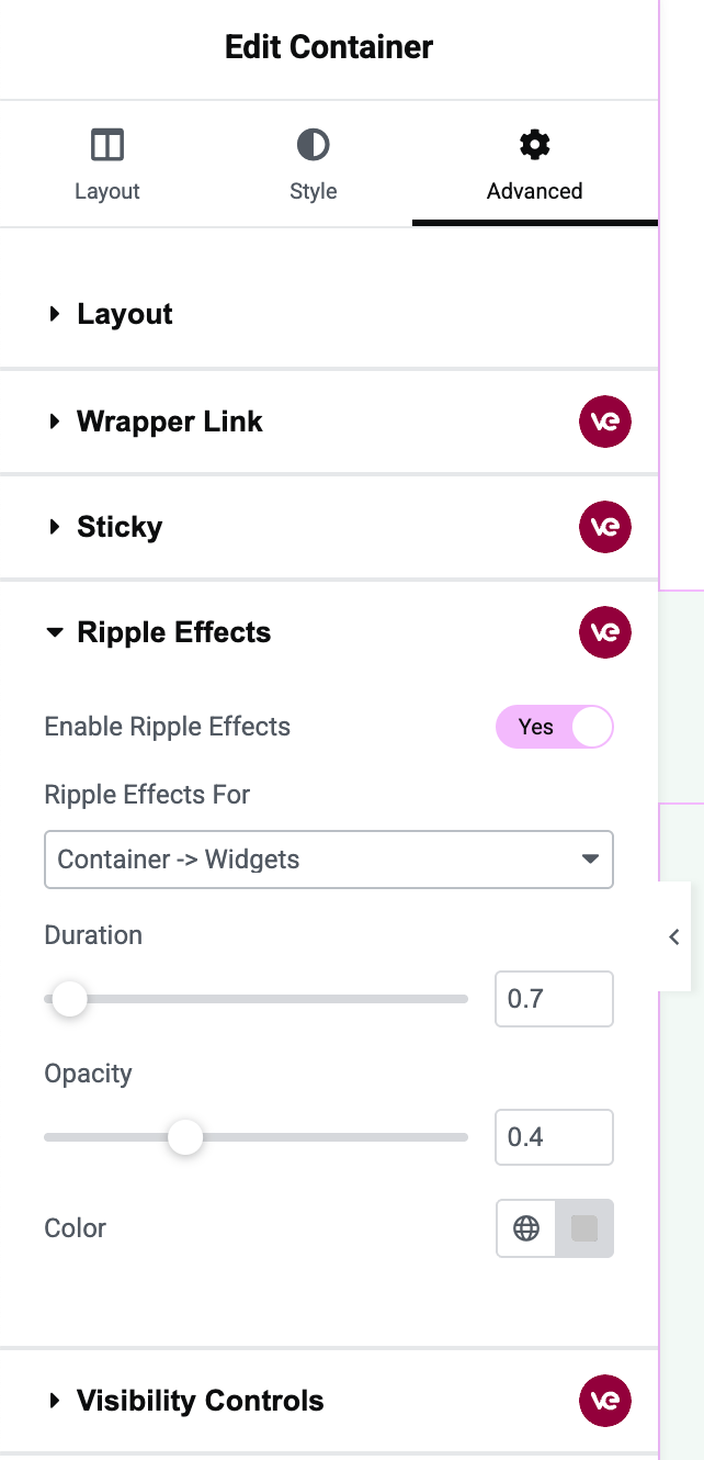 The image highlights the Ripple Effects options: the enable switch is on, and the “Ripple Effects For” dropdown is visible with options like Container, Widgets, Buttons, Images, etc., along with sliders for Duration and Opacity, and a Color picker.
 -
Select Target Elements (Ripple Effects For): Once enabled, you’ll see a dropdown labeled Ripple Effects For. This setting lets you decide where the ripple should apply:
- Container: The ripple will occur when the container itself is clicked. For a section or column, this means clicking anywhere in that area triggers the ripple.
- Container -> Widgets: The ripple will apply to each widget inside the container. Essentially, every child widget within that section/column will have a ripple on click. For example, if a section has several text boxes or images, clicking on any of those will show a ripple confined to that widget’s area.
- Container -> Buttons: The ripple will only target button elements inside the container. If your section has some buttons (e.g., Elementor Button widgets), only those buttons will show a ripple on click, not other elements.
- Container -> Images: Similarly, the ripple will only target image elements inside the container. Clicks on images will ripple, but other content won’t.
- Both (Images and Buttons): The ripple will apply to both images and buttons within the container.
- Choose the option that fits your use case. For instance, if you want an entire section to flash a ripple wherever clicked, use Container. If you specifically want to enhance just the buttons in a section with ripples, choose Buttons.
(If you see a “Custom” option in advanced scenarios, that would let you specify a custom CSS selector. However, in most cases you won’t need this, and it may be more of a Pro feature. The provided options cover common needs.)
-
Adjust Ripple Effect Settings:
- Duration: This slider controls how long the ripple animation lasts (from the moment you click until it fades out). The default is around 0.7 seconds. You can make it quicker or a bit slower. For example, setting it to 0.5s will make the ripple disappear faster, while 1s will linger a little longer.
- Opacity: This sets how transparent or solid the ripple splash is. Default is about 0.4 (40% opacity), which is a gentle effect. You can make the ripple more subtle by lowering the opacity (e.g., 0.2) or more pronounced by increasing it (up to 1 for a solid color, though that’s usually too strong). Adjust to ensure the ripple is visible but not overpowering.
- Color: Pick a color for the ripple. The default gray (
#c5c5c5) works on most backgrounds without being intrusive. However, you might match the ripple color to your theme (maybe your accent color) for a cohesive look. Keep in mind contrast - a ripple should be noticeable against the background of the element being clicked (e.g., a light ripple on a dark button or vice versa).
-
Update the Page: Click Update to save changes.
-
Test the Ripple Effect: Preview the page on the frontend and click on the element(s) you configured:
- If you enabled it on a section or column (Container), click anywhere in that area. You should see a quick ripple expand outward from the click point.
- If set to Widgets/Buttons/Images, click those specific items and you’ll see the ripple effect on each item individually.
- The ripple is an on-click effect, so it only appears when users actively click or tap (on mobile) the element.
This subtle animation can greatly improve user experience by providing instant feedback on clicks, making your site feel more responsive and alive. It’s a small detail that users may not consciously notice, but it contributes to an overall modern look and feel.